
Próximo capítulo da série Battlefield está previsto para chegar ao mercado até março de 2026, de acordo com a EA.
2025-05-07Descubra o que está por trás do relançamento do jogo de estratégia em tempo real brasileiro Outlive, agora em uma versão remasterizada.
2025-05-07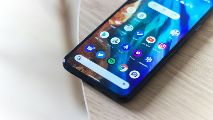
Google has unveiled its new “Material 3 Expressive” design standard, which is expected to be presented at the annual Google I/O event later this year. The new design features more attention-grabbing interfaces for Android apps, making them more vibrant and engaging.
- 15 Android 15 features to expect
- How Android has evolved with each version
- Where do users look on the app? Where is their attention focused?
- Measuring emotional responses to different designs;
- users understand and adapt to new interface features.
The new design concept was briefly published on the Google design blog before being taken down. According to 9to5Google, the blog post explained the Material 3 Expressive concept, as well as the research and concepts involved in its development.
The Google design team questioned why all apps looked so similar, conducting research with over 18,000 participants worldwide to develop their new design direction. The studies focused on:
There is no information yet on whether this design overhaul will come to Android 16. It’s worth noting that the leaked images are just concepts and not final versions that will be released, and changes can still be applied before the official launch.
Expressive Design
In one of the leaked images, there are icons and menus that appear to be from apps like Drive, Agenda, and Photos. These elements have striking colors, more rounded shapes, and greater emphasis on button hierarchy.
“These design aspects are fundamental to making the product more ‘usable’ by highlighting key actions and grouping similar elements together,” the document explains.
Another detail of Material 3 Expressive is the floating pill-shaped taskbar, which replaces the traditional one that takes up the entire bottom screen.
According to Google’s research, this design style is “easier to use” and users find the elements they’re looking for up to four times faster than in the previous version.
In another example, the demonstration shows an app similar to Gmail in the previous language and with the new proposal, this time with the floating pill-shaped taskbar. The send button is larger and no longer appears at the top of the screen. The attached image also appears prominently, and the rest of the interface appears with less information than usual.
Join our WhatsApp channel to stay up-to-date on technology news, launches, tips, and incredible tutorials.