
Nova identidade visual do Google: uma evolução sutil após 10 anos
2025-05-13Novo Android 16 promete trazer design renovado e recursos de atividades ao vivo inspirados na One UI 7
2025-05-13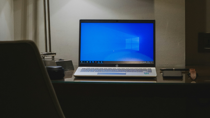
Microsoft shared how the “Start” menu was created for Windows 11. The publication was made on the official design team blog, and it’s the beginning of a series of texts about the creation of their Windows products.
- 5 essential tips to migrate from Windows 10 to Windows 11 without problems
- Windows 11: 6 resources that Windows 10 users are losing
The Start menu is one of the most iconic elements of Microsoft’s operating system, and the company recognized the need to keep it original, but with a “breath” of fresh air in its next update.
After getting user feedback, the starting point that inspired the company to update the Start menu was: “help me find apps faster, keeping the magic and not losing the soul”.
Besides, there was also a desire to keep the Start menu aligned with the Windows 11 philosophy: technology focused on humanity.
The creative process focused on three pillars: exploration, validation, and refinement.
The philosophy and concepts applied are reminiscent of the Design Thinking process, a methodology used to innovatively overcome challenges and solve problems thinking about the best user experience.
According to Microsoft, the main requests met in the redesign, besides being able to find apps with more ease, were: more control, better separation of desktop and mobile resources, and more intelligent suggestions.
And, to make every pixel count, they tested the design on various sizes of screens until the Start menu was perfect on all.
Final Result
new beginningStarting with the Start menu button, which, from Windows 10 to 11, moved from the bottom left corner to a more centralized position.
Besides, it has a more compact and clean design, hierarchizing better the information for the user.
Among other changes in the new design, there are:
- Dynamic recommendations, such as a lost meeting, apps you always open at a certain time, etc;
- More apps in the interface: when opened, the menu shows more apps than before, with the possibility of pinning the ones you want or filtering by different categories;
- Better mobile content division: when connecting your phone to the computer, the notifications don’t disrupt your PC usage, and the menu to access your phone is better;
- Personalization: choose the sections and apps you want and those you don’t want to appear;
- Faster loading timeSee also:
VIDEO: Chat GPT, Perplexity, Claude, Gemini: WHICH one to choose?
Read the article on Microsoft.